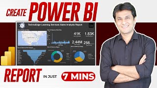
2.4 How to create a Donut Chart in Power BI | Power BI Tutorials for Beginners | By Pavan Lalwani
#pavanlalwani #powerbi #dashboarddesign #dataanalytics
In this tutorial, we will learn how to easily create a donut chart in Power BI. Unlike other BI tools like Tableau, Power BI allows for a simple and straightforward donut chart creation process. We will go step by step through the process of creating a donut chart using the example of region and sales data. By dragging the region into the legend and sales into values, we can quickly build our chart. We will also explore formatting options such as removing the legend, adjusting the size, and customizing the font color and text size. By following these steps, you'll be able to create visually appealing and informative donut charts in Power BI. Watch the video to learn more!
Invest in your future with our Power BI 2023 NEW Course at an incredible 50% discount:
https://learn.pavanlalwani.com/course...
200+ MCQs to test your knowledge.
20+ Assignments for handson practice.
11+ Case Studies for realworld insights.
5+ Industry Projects to build your portfolio.
Course Completion Certificate for your resume.
Tips & Tricks to boost your skills.
5+ Industry Datasets for practical learning.
Join thousands of professionals who have transformed their careers. Enroll now at 50% off!
https://learn.pavanlalwani.com/s/store
You can also explore our Power BI DAX 2023 course and get a 360º understanding of DAX
https://learn.pavanlalwani.com/course...
Invest in yourself. Become a Power BI expert. The future is yours! "
Download Practice Material from Server :
#datacleaning #businessintelligence #powerbi #powerbitraining #microsoftpowerbi
Timestamps:
00:00:03 Easy Donut Chart Creation in Power BI
00:00:28 Legend Removal and Size Increase
00:00:57 Label Style Selection and Name Addition
00:01:15 Donut Chart Creation Summary ✅


