24 | MAKE A WEBSITE RESPONSIVE FOR ALL DEVICES | 2023 | Learn HTML and CSS Full Course for Beginners
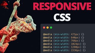
Today I will show you how to make your website responsive using media queries in CSS. Making our website change to fit different devices is crucial, since everyone uses their mobile and tablet devices now a days when surfing the internet. It is therefore important that you make sure your website is made responsive, so all your content looks good no matter the screen size.
➤ TIMESTAMPS
00:00:00 Introduction
00:00:12 Design for mobile or browser first..?
00:01:27 Showing you my example
00:02:12 Mobile tool build into the browser
00:06:02 How to set up media queries
00:08:26 How to define a width break point
00:12:03 All the standard break points
00:14:26 "only screen and"
00:15:46 Landscape and Portrait
00:18:08 How to add two width parameters
➤ GET ACCESS TO MY LESSON MATERIAL HERE!
First of all, thank you for all the support you have given me!
I am really glad to have such an awesome community on my channel. It motivates me to continue creating and uploading content! So thank you!
I am now using Patreon and YouTube Memberships to share improved and updated lesson material, and for a small fee you can access all the material either from my memberships or Patreon, depending on your preference. I have worked hard, and done my best to help you understand what I teach.
I hope you will find it helpful :)
Memberships: / @dani_krossing
Patreon: / mmtuts





![Media Query in CSS [Easiest Way] | How To Write Media Queries FAST](https://i.ytimg.com/vi/xgGg4XQxTWk/mqdefault.jpg)

