
3 modern CSS techniques for responsive design

My free course, Conquering Responsive Layouts: https://courses.kevinpowell.co/conque...
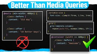
A look at how we can use CSS comparison functions min(), max(), and clamp() for responsive layout techniques, plus a look at Utopia, a fluid type scale that we can use in our projects!
Links
✅ Utopia Fluid Type Scale: https://utopia.fyi
✅ SmolCSS minimal snippets for modern CSS layouts and components: https://smolcss.dev
✅ Modern CSS: https://moderncss.dev
✅ vmin and vmax: • CSS Units: vh, vw, vmin, vmax #css #r...
⌚ Timestamps
00:00 Introduction
00:47 widths with min()
02:53 padding and margin with max()
06:50 typography with clamp()
09:10 fluid type scales with Utopia
#css
Come hang out with other dev's in my Discord Community
/ discord
Keep up to date with everything I'm up to
✉ https://www.kevinpowell.co/newsletter
Come hang out with me live every Monday on Twitch!
/ kevinpowellcss
Help support my channel
Get a course: https://www.kevinpowell.co/courses
Buy a shirt: https://teespring.com/stores/makingt...
Support me on Patreon: / kevinpowell
My editor: VS Code https://code.visualstudio.com/
The theme I use: Atom One Dark
I'm on some other places on the internet too!
If you'd like a behind the scenes and previews of what's coming up on my YouTube channel, make sure to follow me on Instagram and Twitter.
Twitter: / kevinjpowell
Codepen: https://codepen.io/kevinpowell/
Github: https://github.com/kevinpowell
And whatever you do, don't forget to keep on making your corner of the internet just a little bit more awesome!


