5.8 How to create a Gauge Chart in Power BI | Power BI Tutorial for Beginners | By Pavan Lalwani

#pavanlalwani #powerbi #dashboarddesign #dataanalytics
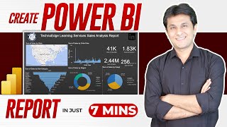
In this Power BI tutorial, you will learn how to create a Gantt chart or a "got" chart. A Gantt chart is a visual representation of a project schedule that helps in tracking progress and identifying tasks. With Power BI, creating a Gantt chart becomes easy with the builtin options. In this video, we will walk through the steps to create a Gantt chart using Power BI.
To start, click on the Gantt chart button and resize it according to your preference. Then, drag and drop the sales data into the Gantt chart. You will see a Gantt chart with the total sales displayed. However, you may notice that the chart does not utilize the space effectively.
To overcome this, we will add an indicator to compare the sales with the target. If you don't have a target field, you can quickly create one using the new measure option. Once the target field is created, you can drag and drop it into the target value section of the Gantt chart.
By doing so, you will be able to see if you have achieved the target or not. The Gantt chart provides valuable insights into the performance and helps in assessing the progress towards the target. You can also integrate the Gantt chart with other charts in Power BI to get a comprehensive view of the data.
Invest in your future with our Power BI 2023 NEW Course at an incredible 50% discount:
https://learn.pavanlalwani.com/course...
200+ MCQs to test your knowledge.
20+ Assignments for handson practice.
11+ Case Studies for realworld insights.
5+ Industry Projects to build your portfolio.
Course Completion Certificate for your resume.
Tips & Tricks to boost your skills.
5+ Industry Datasets for practical learning.
Join thousands of professionals who have transformed their careers. Enroll now at 50% off!
https://learn.pavanlalwani.com/s/store
You can also explore our Power BI DAX 2023 course and get a 360º understanding of DAX
https://learn.pavanlalwani.com/course...
Invest in yourself. Become a Power BI expert. The future is yours! "
Download Practice Material from Server :
#datacleaning #businessintelligence #powerbi #powerbitraining #microsoftpowerbi
Timestamps:
00:00:03 Introduction to Gate Chart
00:00:24 Creating a Gate Chart with Sales Data
00:00:54 Understanding the Value Discrepancy in the Gate Chart
00:01:24 Adding a Target Field to Compare Achievement Levels
00:01:54 Creating a Dummy Target Sales Field
00:02:20 Linking the Target Sales Field to the Gate Chart
00:02:50 Analyzing Achievement Level in Comparison to Target
00:03:10 Creating a Gate Chart for Profit Analysis
00:03:36 Adding a Target Profit Field to the Gate Chart
00:04:06 Analyzing Profit Achievement in Comparison to Target
00:04:36 Utilizing the Gate Chart to Visually Assess Performance
00:04:54 Utilizing the Gate Chart for RegionSpecific Analysis
00:05:07 Interacting with Gate Charts to Observe Various Metrics