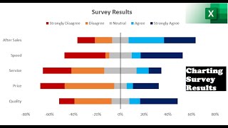
Charting Survey Results in Excel (Visualize Employee Satisfaction results)

Join 400,000+ professionals in our courses here https://link.xelplus.com/ytdallcou...
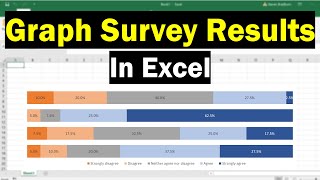
Transform the way you present survey data in Excel with this practical guide. Tailored for professionals who work with survey data, particularly in Likert scale formats, this tutorial showcases innovative ways to visualize responses effectively.
⬇ DOWNLOAD the workbook here: https://pages.xelplus.com/chartingsu...
Key Learning Points:
Stacked Bar Chart for Survey Results: Learn the basics of visualizing survey data using a stacked bar chart, an effective method to display responses like agree, neutral, and disagree.
Diverging Stacked Bar Chart: Discover the diverging stacked bar chart technique, as recommended by Jon Peltier, which centers neutral responses for a clearer comparison across categories.
Data Preparation for Custom Charts: Understand the importance of preparing your data correctly for these specific types of charts, including creating negative and positive values for responses.
Automated Chart Creation with Addins: Explore how to use Jon Peltier's Excel addin for creating diverging stacked bar charts automatically, saving time and effort in data preparation.
Customizing Chart Appearance: Gain insights into finetuning your charts, such as adjusting colors, label positions, and fixing the order of items in the legend for better readability.
Practical Applications:
Present survey results in a visually appealing and easytounderstand format.
Employ advanced Excel techniques for survey data visualization without heavy reliance on manual formatting.
Utilize Excel addins for efficient and automated chart creation, enhancing your data presentation workflow.
Of course the chart can also be applied to any survey data that uses a Likert scale (which is based on people's attitudes or emotions to a topic). This can range from strongly disagree, disagree, neutral, agree and strongly agree.
I show how you can create a stacked bar chart, as well as a diverging stacked bar chart as shown on Jon Peltier's website here (https://peltiertech.com/chartingsurv....
Peltier Tech Chart Utility for Excel: https://peltiertech.com/Utility20/Pel...
Link to Custom Formatting Blog Post: https://www.xelplus.com/excelcustom...
★ My Online Excel Courses ► https://courses.xelplus.com
➡ Join this channel to get access to perks: / @leilagharani
☕ Get the Official XelPlus MERCH: https://xelplus.creatorspring.com/
Not sure which of my Excel courses fits best for you? Take the quiz: https://www.xelplus.com/coursequiz/
RESOURCES I recommend: https://www.xelplus.com/resources/
Let’s connect on social:
Instagram: / lgharani
LinkedIn: / xelplus
Note: This description contains affiliate links, which means at no additional cost to you, we will receive a small commission if you make a purchase using the links. This helps support the channel and allows us to continue to make videos like this. Thank you for your support!
#excel