The easiest way to skyrocket your YouTube subscribers

Choropleth Map? There is a better alternative

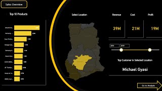
In this video, I show an example of a choropleth map with a diverging color scheme that doesn't work well for the data the map visualizes. For comparison, I present a hexagonal cartogram with a singlehue color scheme that works much better with this specific kind of data. I also briefly explain how to create such a cartogram in Power BI using a custom visual.
===
Data Visualization, Power BI, Choropleth Map, Filled Map, Cartogram, Geographical Shapes, Hexagonal Cartogram, Divergent Color Scheme, Singlehue Color Scheme, Custom Visuals, Map Visualizations, Data Analysis, DataViz


Recommended