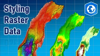
Color Associations For Maps | ArcGIS Pro Tutorial

If there’s a color that’s normally associated with your subject, you should probably use it in your map. This video shares some examples of color choices in maps using ArcGIS Pro. Follow along with the map: https://www.arcgis.com/home/item.html...
The data in this video comes from the following sources:
USA Cropland [https://www.arcgis.com/home/item.html...], USDA NASS
National Hydrography Dataset Plus Version 2.1 [https://www.arcgis.com/home/item.html...], USGS, Esri
USA Parks [https://www.arcgis.com/home/item.html...], Esri, TomTom
USA Census Urban Areas, Esri, US Census Bureau
Surface Air Temperature (Average Annual), Generated using Copernicus Climate Change Service information [2020]
Presidential Election 2020 USA County, MIT Election Data and Science Lab [https://www.arcgis.com/home/item.html...], 2018, "County Presidential Election Returns 20002020", https://doi.org/10.7910/DVN/VOQCHQ, Harvard Dataverse, V11, UNF:6:HaZ8GWG8D2abLleXN3uEig== [fileUNF]
ACS Race and Hispanic Origin Variables Boundaries [https://www.arcgis.com/home/item.html...], U.S. Census Bureau's American Community Survey (ACS) 20182022 5year estimates, Table(s) B03002
Learn more about Esri & ArcGIS:
Website: https://www.esri.com
/ esri
/ esrigram
/ esri
/ esrigis