Create Great Looking Excel Slicers: Professional Slicer Formatting

Alright. Great.
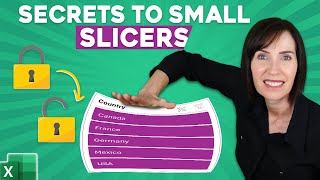
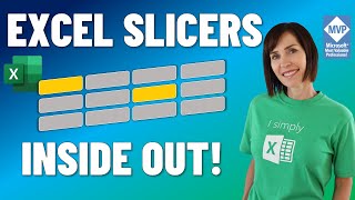
Our task in this lesson is to learn how to improve the formatting of the slicers we have inserted and make them appear nice, keeping in mind the layout we have on the left side.
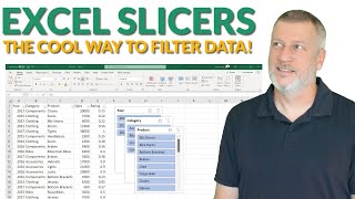
So, let’s do the following. I’ll select all the slicers (I’m holding the Shift key while doing it) and will open the Options tab, which is available only after we have selected at least one slicer.
Here, we can select this tiny arrow showing more options, and it would allow us to create a new slicer style.
All right, in the dialog box that opens, we can see a list of elements that determine how the slicer looks when a certain event occurs: “When an item is selected and it contains data”, “When an item is selected and it does not contain data”, “When an item is not selected and contains data”, “When an item is not selected and does not contain data” and so on… You can spend a lot of time to improve these settings!
Let me show you how it’s done in our case.
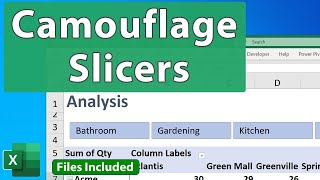
I will select the “Whole slicer” element below and click on the “Format” button. This brings up the usual formatting dialog box we have seen before. First, let’s apply borders to the slicers we have. We can use a light grey color.
Then, once we’re ready to insert borders, we can click on “Selected Item with Data” and change the fill color of selected items with data to the green we’ve used for the entire report. This synchronizes the colors within the sheet, and it appears much more professional.
Our next task is to determine how unselected items with no data would appear. I’ll select this element and click “Format”.
It’s ok for these elements to be almost transparent (a grey or white fill is appropriate), given they are not selected, and it should be clear for the user this is an element not currently displayed. But we should also be able to clearly distinguish them, so let’s introduce borders. I will select the borders tab and add a grey border.
These modifications are fine for now. Let’s click OK and see the slicer’s appearance after the changes we’ve made.
Looks good! Doesn’t it?
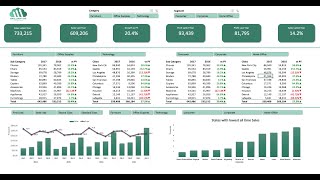
Once we make a selection, the selected items appear in a certain way (in this case, all selected cells continue to be green), the unselected items are grey (as you can see here), and the items with no data are white. If I remove the filter, all elements become green, which is exactly what should happen.
Our report looks awesome! In the next lesson, we’ll look at it and discuss its applications.
That’s all for now. Thanks for watching!
On Facebook: / 365careers
On the web: http://www.365careers.com/
On Twitter: / 365careers
Subscribe to our channel: / 365careers