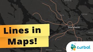
Create Interesting Maps📍in PowerBI

Here is interesting technique to add more value to your Map Visual in Power BI.
===== ONLINE COURSES =====
✔ Mastering DAX in Power BI
https://goodly.co.in/learndaxpowerbi/
✔ Power Query Course
https://goodly.co.in/learnpowerquery/
✔ Master Excel Step by Step
https://goodly.co.in/learnexcel/
✔ Business Intelligence Dashboards
https://goodly.co.in/learnexceldash...
===== LINKS =====
Blog https://www.goodly.co.in/blog/
Corporate Training https://www.goodly.co.in/training/
Need my help on a Project https://www.goodly.co.in/consulting/
Download Map https://www.goodly.co.in/wpcontent/u...
===== CONTACT =====
Twitter / chandeep2786
LinkedIn / chandeepchhabra
Email [email protected]
===== CHAPTERS =====
0:00 Intro
0:10 Generic Maps v/s an Interesting Map
1:59 Creating Measures for the Map
5:31 Formatting the Map
9:39 Finally comparing the 2 Maps
10:48 Courses
===== WHO AM I? =====
A lot of people think that my name is Goodly, it's NOT ;)
My name is Chandeep. Goodly is my fulltime venture where I share what I learn about Excel and Power BI.
Please browse around, you'd find a ton of interesting videos that I have created :) Cheers!
Music By: "After The Fall"
Track Name: "Tears Of Gaia"
Published by: Chill Out Records
Source: https://goo.gl/fh3rEJ
Official After The Fall YouTube Channel Below
https://www.youtube.com/channel/UCGQE...
License: Creative Commons AttributionShareAlike 4.0 International (CC BYSA 4.0)
Full license here: https://creativecommons.org/licenses