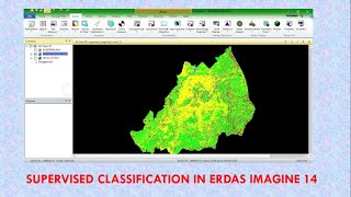
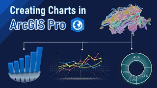
Create Time Series Graph in Arcmap using Attribute Tabel

Time Series Graph:
Time series graphs can be used to visualize trends in counts or numerical values over time. Because date and time information is continuous categorical data (expressed as a range of values), points are plotted along the xaxis and connected by a continuous line. Missing data is displayed with a dashed line.
Before designing and creating a graph, you should determine what information you want to convey. Decide whether you want to illustrate data trends, relationships, distributions, or proportions in your data. Do you want to track changes over short or long periods of time? Determine the relationship between different variables? Compare different groups of variables or track changes over time? Deciding what it is you want to do will help you select the appropriate type of graph to use.
Your graph can be created for all features in a dataset or just selected ones. The dataset can be a feature class, a layer, an integer raster, or tabular data. Keep in mind that some graph types are designed to effectively display a limited amount of data, so choose your graph type appropriately. Alternatively, you might consider making more than one graph.
#arcgis
#arcmap
#timeseriesanalysis
#timeseries
#attribute
#AttributeTable
#gis
#tutorials
#arcgistutorial
#gistutorial
#GIS&RSProfessionals