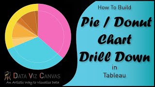
Drill down donut chart in power BI
Drill down donut chart in power BI
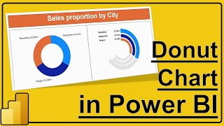
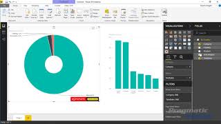
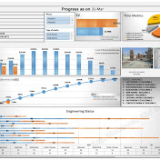
Drill Down Donuts is designed for exploring multilevel data in depth and across the level of interest.
Start with the overview and #drilldown into details with just a tap or click on a slice.
Click/tap in the middle to return to previous level.
Dynamic “Others” slice allows you to group smaller slices into one, which you can explore with a click/tap.
In this example, we are looking at actual progress and planned progress.
With drilldown you can easily see how progress and plan are grouped by Building, trade, floor.
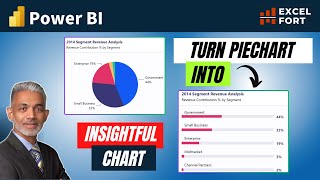
The Pie #Chart is an “industry standard” for conveying the relationship of parts to the whole.
You will use pie charts when you want to show how specific aspects – or slices – of your data contribute to the big picture.
#Pie Charts are easy to understand even by users who don't have a statistics background and therefore are preferred for showcasing data for public consumption.
Most commonly we see this visual used as an interactive filter for the whole report, since it is more intuitive and visually appealing than using a typical slicer visual.
Pie charts are seldom used for showing changes over time. It’s also not a common practice to use a pie chart if you need to compare data that is not summarized into a grand total.
• Drill down donut chart in power BI