
Elementor Breakpoints: How to Configure Website for Different Responsive SCREENS SIZES!

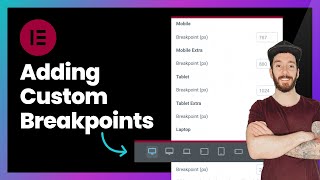
Learn in this Elementor WordPress tutorial: how to enable and configure additional custom breakpoints in Elementor to have a responsive website with Elementor, WordPress and WooCommerce. I also teach how to configure the responsive website correctly on one screen/device so that it doesn't look wrong on other different screens. Breakpoints in Elementor serve to have more screen size options to configure the website for other types of screens and devices, in addition to the conventional ones: Desktop, Mobile and Tablet, which are already standard in Elementor. By activating other screens in Elementor, you can configure mobile lying down (configure mobile lying/horizontal), configure Elementor for Large Monitor, configure Elementor for TV, for tablet horizontally and vertically, configure website for notebook/laptop. Finally, with Breakpoints you can configure the website to be responsive on all possible screen sizes, including vertical and horizontal mobile devices (standing and/or lying down).
Click Here: https://bit.ly/swSubscribeNow'>https://bit.ly/swSubscribeNow
✅Hostinger: Web Hosting with Extra Discount of +10% OFF through the link: https://www.hostg.xyz/SHELK + Coupon Code SIMPLIFYINGWEBSITES
✅Get Elementor Pro here: https://simplifyingwebsites.com/eleme...
Mentioned videos and others you may also like:
How to Use GRID CONTAINER in Elementor • New! How to Use GRID CONTAINER in Ele...
How to Use Elementor FLEXBOX CONTAINER Correctly • How to Use Elementor FLEXBOX CONTAINE...
How To Make a WordPress Website Using Elementor FREE • How To Make a WordPress Website Using...
Definitive Guide to IMAGE SIZES for WordPress and Elementor Websites • Definitive Guide to IMAGE SIZES for W...
How To Convert Sections into Flexbox Containers in Elementor • How To Convert Sections into Flexbox ...
How To Create a Sticky Header with Elementor Pro • Elementor Header | How To Create a St...
✅Title: Elementor Breakpoints: How to Configure Website for Different Responsive SCREENS SIZES Share the video: • Elementor Breakpoints: How to Configu...
Every Web Designer and Entrepreneur who creates a website with WordPress, WooCommerce and Elementor always needs to adapt/configure the website so that it is responsive on different types of screens. And it may happen that when configuring the website for Desktop/Computers, Cell Phone and Tablet, I still need to adjust other screen sizes, such as monitors, Television, Tablet in Horizontal, Cell Phone in Horizontal (lying down), among others. To have these other types of screen sizes to configure/adapt the website so that it is responsive on these other screens, you need to activate “Additional Custom BreakPoints” in Elementor Pro/Elementor Free.
In this video I show how to activate these other screens in Elementor and how to configure a website to be responsive, that is, to adapt to other screen sizes. I also show how to configure the website on a certain screen size so as not to ruin it on another screen/different device.
Thanks for Watching!
Subscribe and turn on the notification bell to see new videos and tips about WordPress, Elementor, Woocommerce, and Website Hosting. Click Here: https://bit.ly/swSubscribeNow'>https://bit.ly/swSubscribeNow
#Wordpress #Elementor #Webdesign
![How to Make Optimize Website for MOBILE Devices in Elementor Flexbox Container [Responsive Website]](https://i.ytimg.com/vi/Vxij3RvjbR0/mqdefault.jpg)


