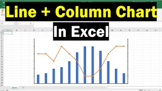
How to Combine Charts in Excel to analyze different informations | Column and Line
In this Excel video tutorial, we gonna see How to Combine Charts in Excel to analyze different informations. We will use the Column chart coupled with the Line chart.
Combining charts in Excel is a powerful way to analyze and present different types of information together, making it easier to compare and draw insights from your data. Here’s a guide on how to combine charts to analyze metrics like average margin and sales.
Why Combine Charts?
Combining charts allows you to:
Compare different data series on the same visual scale.
Highlight relationships and trends between different types of data.
Provide a comprehensive view of performance metrics.
Common Types of Combined Charts
1. Column and Line Chart: Useful for comparing a series of data that have different units or scales.
2. Bar and Line Chart: Similar to column and line but uses horizontal bars.
3. Combo Chart: A mix of any two or more chart types.
Tips for Effective Combined Charts
Clarity: Ensure that the chart is easy to read and interpret.
Labels: Use clear labels for both primary and secondary axes.
Consistency: Maintain consistent color schemes and chart styles.
Annotation: Highlight key points, trends, or anomalies in your data.
Combining charts in Excel can greatly enhance your ability to analyze and present multiple data sets in a cohesive manner, making it easier to uncover insights and drive decisionmaking.
#JopaExcel #Dashboard #Excel


