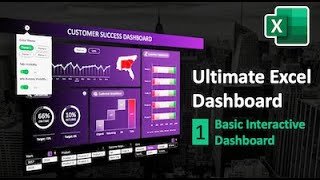
How to create a fully *INTERACTIVE* and AWESOME Dashboard in Excel (tutorial + sample files)

Download the file from https://chandoo.org/wp/awesomeexcel...
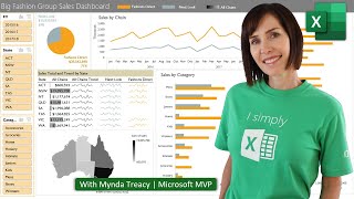
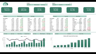
YES, totally made in Excel, this beautiful, interactive & insightful dashboard is the finest example of what you can achieve with Excel. In this epic video, let's create a magnificent dashboard. Join me on this unforgettable journey.
Topics covered in this video:
=========================
◉ How to design an executive dashboard?
◉ Picking colors, themes and formats for the dashboard
◉ Using Data model, Power Pivot & DAX to calculate values for the dashboard
◉ Creating and formatting KPI tiles using TEXT formula
◉ Setting up interactive maps using dynamic picture links
◉ Creating custom charts with bubble & donut charts
◉ Using FILTER, SORT, SORTBY formulas to create dynamic tables for the dashboard
◉ Applying conditional formatting rules to make the tables PRETTY
◉ Setting up sparklines to show insights & trends
◉ Adding sort options with data validation
◉ Integrating slicers for interactive dashboard experience
Download the Sample Files:
=========================
You can download the blank data file from here https://chandoo.org/wp/awesomeexcel...
UNLOCK full files + Video downloads:
=================================
You can now get the full dashboard workbook, 7 work in progress files, 2.5 hours of video + 32 hours of videos on Advanced Excel, when you join Excel School + Dashboards program.
To enrol and access this right away, visit https://chandoo.org/wp/excelschoolp...
⏱Video Timestamps
===================
0:00 Introduction to the Dashboard
1:50 What you are going to learn
3:28 Setting up the dashboard workbook
6:47 Setting up the data model & calculations worksheet
12:07 Using DAX & Power Pivot to build measures
16:26 Calculating monthly values
18:10 Adding the category slicer
21:00 Final summary values calculations
24:15 Making the KPI tiles
33:20 Integrating the category selection with KPI tiles
39:19 Finetuning the KPI tiles
39:45 Adding country maps to the dashboard
42:48 Sorting the country pivot data (formulas)
47:38 Working with the map images (picture link and formulas)
53:23 Highlighting the best country map
56:05 Adding other metrics next to the country maps
1:00:50 Adding the Sort options to the dashboard
1:03:37 Team performance area of the dashboard
1:06:46 Team related Pivots
1:08:00 Adding the Team performance chart (Bubble chart)
1:17:30 Placing and formatting the chart on dashboard
WATCH PART 2:
================
• How to create a fully *INTERACTIVE* a...
LEARN MORE ABOUT DASHBOARDS:
=================================
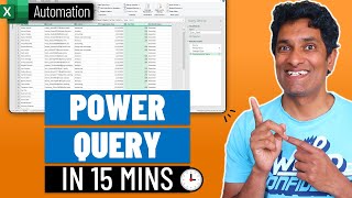
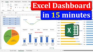
Dashboard in 15 minutes with Pivot Table based techniques • Call Centre Dashboard in Excel (Ea...
Project Management Dashboard with Excel • Make an awesome Project Management Da...
Web Analytics Dashboard with Excel • Make an Excel Dashboard in just 15 mi...
Excel Dashboards PLAYLIST • How to Make Excel Dashboards
~
#Dashboards #excel