Excel Pro Tips: Unveiling Timeline Chart Secrets!

Unlock the potential of Excel with Timeline Charts – the ultimate visual tool to showcase chronological events, past or future! In this comprehensive guide, I'll walk you through crafting compelling Timeline Charts in Excel. Learn the art of transforming a standard clustered column chart into an elegant timeline masterpiece using transparent bars and error bars. Elevate your chart's allure by finetuning formatting on the error bars and horizontal axis.
Discover the magic of enhancing your Timeline Chart's visual appeal with strategically placed data labels, bringing your events to life on the chart. Utilizing a simple table with months, events, and event values, you'll witness how negative values ingeniously position events beneath the horizontal axis.
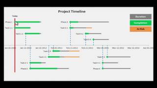
Delve deeper into Excel mastery as I unveil the fusion of Timeline and Line Charts, enabling profound analysis of event impacts on sales figures. By integrating a line chart with a bar chart showcasing events on a secondary axis, explore a nuanced understanding of the causeandeffect relationship. Crafted from a table with weeks, sales figures, and event heights, you'll grasp the art of strategically placing events to avoid overlap and maintain chart clarity.
This tutorial navigates essential topics: timeline diagram creation, milestone charts, and project milestone visualization in Excel. Explore the power of Excel charts with actionable insights on creating, visualizing, and analyzing data with Timeline Charts.
0:00 Intro
1:37 Insert the bar chart
2:35 Add and adjust error bars
4:02 Adjust the horizontal axis
4:42 Add events as data labels
6:48 Creating a combined timeline and line chart
7:12 Insert the line chart
7:55 Add bar chart for timeline
9:10 Adjusting the timeline chart