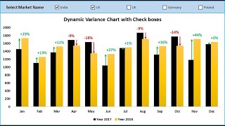
How to Create Variance Charts in Excel with Percentage Change (simple u0026 uncommon technique)

Join 400,000+ professionals in our courses here https://link.xelplus.com/ytdallcou...
In this video you'll learn how to dynamically highlight maximum and minimum values in line charts in Microsoft Excel. This tutorial is perfect for those looking to add more advanced, eyecatching elements to their Excel charts.
⬇ Get the workbook here: https://pages.xelplus.com/variancech...
Key Learning Points:
Dynamic Highlighting Technique: Learn how to dynamically highlight the highest and lowest points in a line chart to make your data stand out.
Adding Series for Conditional Formatting: Understand the need to add new series to the chart for conditional formatting of max and min points.
Customizing Markers and Data Labels: Get insights into customizing the markers for max and min points and changing the data labels' color and positioning.
IF Logical Test Application: Discover how to use an IF logical test to identify and highlight the max and min points in your dataset.
Interactive and Responsive Chart: See how changes in data automatically update the highlighted points in the chart, keeping your data representation accurate.
Practical Demonstration: Follow a stepbystep guide using an example with actual sales data to apply these techniques in a realworld scenario.
Tips and Tricks: Learn additional tips for chart formatting, including adjusting gridlines and data label colors for enhanced readability and impact.
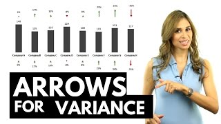
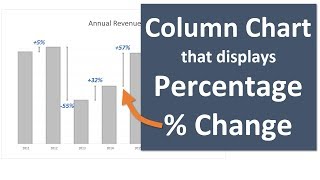
In a previous video ( • Excel Variance Charts: Actual to Prev... ), I showed you how you can use conditional formatting in Excel Column or Excel Bar charts. I also showed you how you can conditionally format the data labels in Excel graphs to show a different color if the values are positive to when the values are negative.
In this video, I show you how you can use the Excel error bar technique to create really thin bars (or thick lines) which has a more subtle effect. The result is a visually effective chart that doesn't distract the readers attention from the main chart but also communicates the difference to previous year visually as well.
The chart doesn't just use the error bar technique but it also conditionally formats the bars so they are green if the data points are positive and red if the data points are negative.
This technique works for all Excel version.
★ My Online Excel Courses ► https://www.xelplus.com/courses/
➡ Join this channel to get access to perks: / @leilagharani
☕ Get the Official XelPlus MERCH: https://xelplus.creatorspring.com/
Not sure which of my Excel courses fits best for you? Take the quiz: https://www.xelplus.com/coursequiz/
RESOURCES I recommend: https://www.xelplus.com/resources/
Let’s connect on social:
Instagram: / lgharani
LinkedIn: / xelplus
Note: This description contains affiliate links, which means at no additional cost to you, we will receive a small commission if you make a purchase using the links. This helps support the channel and allows us to continue to make videos like this. Thank you for your support!
#excel