How to make a Dashboard in Excel with Pivot Tables and Charts

EXCEL FILE TO DOWNLOAD: https://jopaexcel.com/wpcontent/uplo...
In this Excel video tutorial, we gonna learn How to make an Interactive Excel Dashboard using Pivot Table and Pivot Chart in Excel.
In this Excel video tutorial, we will learn how to make a Dashboard in Excel from scratch and step by step. We will also learn how to make a table in Excel, how to make a pivot table in Excel and how to make a pivot chart in Excel. You can download this Excel sales sheet for free to follow this lesson along with me.
We gonna learn five different functions. Sumifs, Averageifs, Countifs and Text.
we going to use the sumifs function in Excel to have an addition, but not of all the numbers, just the values that match with our criteria. So let's say you want to make an addition using a condition you can do it through the sum if formula.
the second function that we're going to use is the average if, following the same logic as the sumif formula, it can take the average not of all the values but just the values that match with our criteria.
the third function is going to be the count if and it's going to count the values the match with our criteria. It's going to count everything that corresponds to the conditions that we set.
the last but not least important is the text function, the text formula can help us to extract just the month from a date. So let's say we have a complete date with the month, the day, and the year. Example, January 1st of 2024, and I want to extract just the month of this date, I can use a text function to help me with this task.
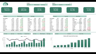
The Dashboard is also known as the control panel. It is a visual management tool that presents, in a clear and objective way, everything you need to monitor the evolution of your business results and ensure the achievement of your goals. With the Dashboard you can analyze the results in a simple and interactive way, in addition to helping you make decisions on a daily basis and in the job market.
To make a Dashboard in Excel, we can follow the steps.
1 Have a Dataset.
2 Adjust the Dataset with needed.
3 Create Analyses using functions or formulas.
4 Create the Dashboard Background Image with Objects or Shapes or Icons.
5 Create PivotCharts and Value Cards.
Having a database in Excel is the first step, as we need information so we can create graphs, tables, pivot tables and pivot charts, etc. A database is needed to create the Dashboard.
Creating a Table in Excel is using the Tool called format as table. So, let's take our database and transform it into a table with a very important Excel functionality.
Creating a PivotTable in Excel can help us a lot in creating the Dashboard, because with the pivot table we can make dynamic charts, that is, whenever we make any filters or data segmentation, the information in the charts will update automatically. Pivot table is also known as pivot table and pivot chart is known as pivot chart.
Data segmentation, or also known as options box, list of options, filter button, selection buttons, dynamic filter, etc., will be very important to make our spreadsheet interactive in Excel.
Every time some information is selected from the slicer box, all values in the worksheet, all values in the Dashboard will be updated automatically. This way, we were able to make our Excel spreadsheet interactive and dynamic. Just with clicks we can filter the information we need to view.
Creating the Dashboard background is very important because we can make the dashboard modern and beautiful just with the image we choose for the Excel spreadsheet screen background.
We can use figures and objects such as rectangles, squares, circles, rectangles with rounded corners, etc. In addition to being able to use icons or images from our computer.
Dynamic charts, or pivot charts, will make our dashboard more beautiful and interactive in Excel. Every time any value is filtered and information is segmented, the graphs update automatically, showing only the selected information.
#JopaExcel #Dashboard #Excel