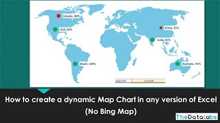
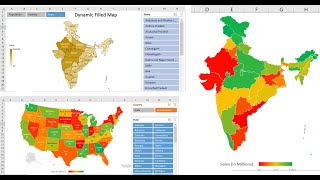
How to make a Map Chart in Excel - Quick u0026 Simple Tutorial

You can create easy and powerful map charts in Excel in just 3 steps.
1) Select your data (geographical column and some numeric column)
2) Go to Insert Ribbon and click on Maps → Filled Map
3) There is no step 3. Your map is ready!
Get the sample file and more from here https://chandoo.org/wp/interactivema...
~
More on charting:
I love making beautiful & insightful charts. Do watch these other tutorials for some tips & wins on making amazing charts.
Budget vs. Actual chart (must watch) • Make a BEAUTIFUL Budget vs. Actual ch...
Waffle chart (yummy) • Impress your boss with Waffle Charts ...
Dynamic chart with Check boxes (Crazy) • Make an AWESOME Dynamic Chart with Ch...
Top 5 items in the chart • Create a Top 5 Dynamic Chart with thi...
Advanced Gantt chart • Advanced Gantt chart in Excel with dr...
Risk map • How to create risk map in Excel Cha...
Charting tips & tutorials PLAYLIST • Smart Charts for Storytelling
~
Even more on charting & advanced charting:
I cover charting & data analysis extensively in my online course. Consider joining that program if you want to become a master storyteller with your data. Visit https://chandoo.org/wp/excelschoolp... to sign up.
~
#charting #excel