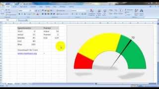
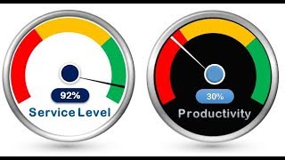
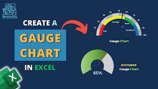
How To Make An Excel Speedometer (GAUGE) Chart

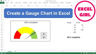
In this YouTube tutorial, I'll show you how to create a Gauge Chart in Excel. It's a visually appealing way to represent percentages, similar to car dashboard gauges. We'll cover data setup, creating the grey and color portions, displaying both charts together, adding a percentage label, and grouping the charts. I'll also share tips on customizing the gauge. Stay tuned for more tutorials on progress charts, and feel free to leave questions or feedback in the comments below! DOWNLOAD THE WORKBOOK ►https://www.excelcampus.com/charts/gu...
LINKS
Get free weekly Excel tips: https://www.excelcampus.com/newsletter/
Free 60minute Excel training session: https://www.excelcampus.com/blueprint
Join Our Comprehensive Excel Training Program: https://www.excelcampus.com/elevate
Related Content
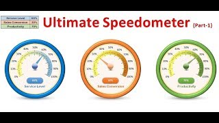
✅ 8 Types of Progress Charts: • Progress Charts in Excel! 8 Types Tha...
✅ 10 Crazy Excel Charts: • Get Ahead With These 10 Advanced Exce...
✅ Percentage Change in Excel Charts with Color Bars: • Percentage Change in Excel Charts wit...
#MicrosoftExcel #MSExcel #YouTubeForLearning #excelchartstutorial
00:00 Introduction
01:15 Alternative Boring Gauge
01:51 Explaining Source Data
02:44 Building the Chart
10:22 Conclusion


![How to Instantly Improve Your Excel Charts [Watch This!]](https://i.ytimg.com/vi/TqBYfMxVTc4/mqdefault.jpg)