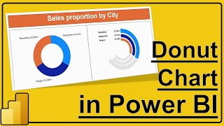
How to make Progress Circle Chart in Power BI

In Power BI, we will teach you how to make Progress Circle Chart using Doughnut Chart in Power BI Desktop for showing Percentage Metrics. Progress Donut Chart helps you see single metric of percentage whether reached target value or not. You will get more awesome videos like this in Power BI Tutorial Series @PettakaTechnologies
=================================================
#Tutorial #PowerBI #PettakaTechnologies #BusinessIntelligence
=================================================
This video covers below topics:
1) How to create calculated measure for Percentage in Power BI?
2) How to create matrix visualization in Power BI?
3) How to make Progress Circle Chart in Power BI?
4) How to format Progress Donut Chart in Power BI?
5) How to calculate percentage in Power BI?
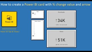
6) How to create Card Visual in Power BI
================================================================================
Learn Business Intelligence with Microsoft Power BI from Pettaka Technologies. Power BI Tutorial for Beginners 2020.
Power BI by Pettaka Technologies.
Data Cleaning with Power Query of Power BI.
Data Visualization with Microsoft Power BI.
==============================================================================
For more awesome Power BI Tutorial videos, visit our official YouTube Channel
Pettaka Technologies
Playlists:
Microsoft Excel : • MS Excel Tutorial
Excel VBA Macro : • Playlist
Power BI : • PowerBI Tutorial for Beginners
Power BI DAX Tutorial : • Power BI DAX Tutorial
==============================================================================
Connect with us:
Subscribe | / pettakatechnologies
Facebook | / pettakatechnologies
LinkedIn | / pettakatechnologies
Twitter | / pettakatech