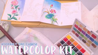
I'm Torn- Easily Influenced by Kristy Rice's Free Spirited Watercolor u0026 Watercolor Palette

Make sure you watch this as well! • An Addendum to the Kristy Rice Art fo...
Shownotes:
Full shownotes here: https://docs.google.com/document/d/1h...
Note: I do not have typed up notes for the book review, if that's something yall would like to see with future book reviews, let me know!
Unboxing:
Really liked the cardboard box and the palette itself, but felt like the bubblewrap AND the plastic wrap were overkill and wasteful, esp since she did cornstarch peanuts?
Included a double sided postcard and an envelope, nice touch.
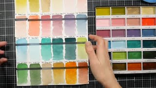
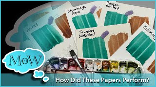
Swatching on her paper:
Her swatch card is a joke. It's on like, cardstock (great for printing and folding, AWFUL for watercolor or judging watercolor?), it's double sided and invites double sided swatches and play (again, WHY ON THIS PAPER), and is huge for the palette. The swatches are in reverse row order, btw, so you have to kinda seek and find to figure out where the colors go. The colors use nonstandard paint names, partially to be cute (like Jane Davenport) but also to hide what colors these colors are trying to be. NO pigment info available.
On Blick:
Swatches a bit better on this, a better representative of what the colors actually are, but still...very underwhelming.
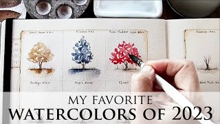
Color Mixing:
Since there aren't a lot of traditional primaries or mixing colors, I kinda wung it
Because the color choices are interesting, you can theoretically mix some interesting colors, but most dry less saturated than the parent colors, even with really intense colors like Flow and Passion, or Flow and Fearless. These seem to fall apart and quickly lose their impact with the addition of water (and yes, I realize that's how you dilute watercolors, but like, more than you would expect or want to see) The 'opaque' colors REALLY fall apart fast, as does the fluoro.
This would not be the palette I'd pick for painting people, that's for sure.
Wet into Wet:
Lol, these are definitely dye based, they really start to fall apart in water. It takes a lot more paint to get any kind of color. These are also getting used up pretty fast. I feel these are more student grade than professional grade, which is funny, because again, Kristy did that big student grade comparison video, like she knows what bad watercolors (or mediocre watercolors) look like.
Compared against professional grade watercolors
I might be biased bc I mean, these are watercolors I selected, rebuy, and use, but I feel like the professional versions just shine brighter. More opacity when there needs to be opacity. Interesting granulation in Moonglow, Undersea green, and Cascade green. Granulation and nuance ot payne's grey. Compared to their professional cousins, Kristy's feel very flat.
Lift Test:
Fieldtest on her postcard
Hooo ok I have a lot of complaints
The postcard itself is probably fine it MIGHT be a cottonrag? It's not really the problem.
Pros:
In general, I really enjoyed Kristy's Art for Joy's sake book, and I think it contains a lot of great projects, information, and exercises. I wish it included more step by step photos, but I understand how hard it is to constantly take those. I also feel like you can probably find demonstrations of some of her techniques online if you dig (her YT channel doesn't really make it obvious, but I'm sure it's there)
The Palette:
The tin it comes in is very cute
The included postcard is a nice little touch
The branding makes it very clear that this is kinda a fan product? She's all over it. That said, I think her art is gorgeous, and her art prints are VERY fairly priced, and she has other art kits that include paintable linearts (haven't tested the paints included, so not sure about the quality), and I think that might be a better way to spend your money supporting Kristy than this particular palette.
The Cons:
I think it's overpriced for the quality of paints inside, but she does include an hour long getting started video, so that is an added value IMHO
The Paul Ruben's Professional 24 color set (which I can vouch for) is $39.99 on Amazon, and is a better value for the paint (https://amzn.to/3YTvmvd)
The Verdict:
Going to need to pull some seamiart footage to demonstrate your point.
Liked the book, did not like the palette
Chapters:
00:00 Disclosure
00:22 Introduction
11:05 Book Review
29:09 Kristy Online
37:28 Opening the Box
39:22 The Palette
47:36 Swatching on Her Paper
50:14 Swatching on Blick
54:25 Color Mixing
57:45 Wet into Wet
1:01:36 Swatching Kristy's Recommended Colors
1:05:05 The Lift Test
1:08:55 The Fieldtest
1:14:27 Talking About Art Influencer Brushes
1:26:49 The Verdict
Music:
Sunny Travel Nico Staf
The Story of One Life
The Story of One Life
Tranquility Kevin MacLeod
Angevin 70 Kevin MacLeod
Inner LightKevin MacLeod
Bab Tista Text Me Records__GrandBankss
Sunset DreamCheel
#artinfluencer #watercolorpalette #watercolorbook