Introduction to Visual Analytics with Tableau (Part 3 of 3) (Dashboards and Stories)
This video is part three of a threepart visual analytics software tutorial series. In the series, I will give you an introduction to visual analytics using the Tableau Software. If you want to learn how to use interactive visual interfaces such as geographic maps, timelines and treemaps to derive insights from data, this tutorial is for you!
In this visual analytics software tutorial series, I'll first give you an introduction to the idea of visual analytics which is often summarized as the use of visual interactive interfaces that are used to derive insights from large volumes of data.
After that I'll give you an overview of the Tableau Software which is an industryleading visual analytics software. I'll show you some of Tableau’s key features that hopefully will inspire you to work with different forms of data end to create interactive visualization that help you find Trends and patterns in your data.
If you're brandnew to Tableau I'll first go over some key Tableau Concepts as Tableau is a very specialized software with its own vocabulary of terms. Some of them are similar to software you may be familiar with like Microsoft Excel the Tableau really is its own unique environment to work in.
The remainder of the video series will then focus on a visual analytics case study tutorial where I’ll show you how you can apply the concepts of visual analytics in Tableau to create dashboards for investigating COVID vaccination records. Specifically, I will use a publicly available COVID vaccination data set for this tutorial so you can gain some handson experience working with a realworld data set so you can begin to learn digital analytics skills.
Instructions for the handson tutorial, including datasets used in the videos, are available for free to download from this link:
http://gisfordisastermanagement.com/y...
The full threepart video series with time codes for each video:
Part 1:
Part 1 Link: • Introduction to Visual Analytics with...
Part 2: Tutorial Tasks 12 (Data Processing Maps, Treemaps, and Timelines)
Part 2 Link: • Introduction to Visual Analytics with...
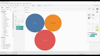
Part 3 (this video): Tutorial Tasks 35 (Create Dashboards; Create a Story; Export Deliverables)
0:00:00 Start
0:00:23 Task 3: Step 1 Create Dashboard
0:01:23 Task 3: Step 2 Observe Dashboard Interactions
0:05:13 Task 4: Step 1 Identify Story elements
0:11:15 Task 5: Step 1 Export Dashboard Image
0:11:33 Task 5: Step 2 Export Dashboard Image(s)
Part 3 Link: • Introduction to Visual Analytics with...
Follow these links to access items mentioned in the videos:
Tutorial Instructions:
http://gisfordisastermanagement.com/y...
Software:
Tableau Desktop trial https://www.tableau.com/products/trial
References Cited:
Keim, D. A., et al. (2018). Visual Analytics. Encyclopedia of Database Systems. L. Liu and M. T. Özsu, Springer Science+Business Media: 44634469.
https://www.tableau.com/whytableau/w...
https://help.tableau.com/current/pro/...
https://help.tableau.com/current/pro/...
https://help.tableau.com/current/pro/...
https://help.tableau.com/current/pro/...
If you liked this and other videos on the geographic information science channel, please like these videos, leave comments, or subscribe to this channel so you can stay informed of new videos.
Subscribe to this channel:
https://www.youtube.com/user/GIScienc...
Also, feel free to contact me if you have any questions, I love hearing from the YouTube community.
Thanks for stopping by!
Brian Tomaszewski, Ph.D.
@bangeobrian
http://gisfordisastermanagement.com/
/ briantomaszewski452b1387


![The moment we stopped understanding AI [AlexNet]](https://i.ytimg.com/vi/UZDiGooFs54/mqdefault.jpg)






![Beginner Power BI DAX Functions Tutorial [Full Course]](https://i.ytimg.com/vi/QJw4HkagVWc/mqdefault.jpg)


