Japanese web design: weird but it works. Here's why

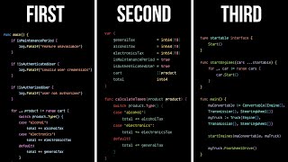
Japanese website design looks weird. But, they work just as well as other websites around the world. Why is that? I mean, they're information dense, cluttered, and some would even think they were teleported to the 1900s. Turns out, beneath the overwhelming user interface lies undeniable psychology.
In this video, I cover why this "weird" design is necessary, why Japan can't just keep things simple, what a "gentle" user experience means, and how all of this impacts us.
Music
• Jazz Music #4 (No Copyright)
• My Best Friend is a
• Persona
Sources
https://bootcamp.uxdesign.cc/10thing...
http://www.nabusinesspress.com/ajm/b...
• Day in the Life of a Typical Japanese...
• Leadership Speaker Erin Meyer: Low Co...
https://pubmed.ncbi.nlm.nih.gov/21911...
https://journals.sagepub.com/doi/10.1...
• Why Japanese Technology Fell Behind
• The psychology of culture | Fernando ...
You're busy, I gotchu
0:00 So many questions
1:07 Why is "weird" design necessary?
2:06 There's more complexity?
3:03 What's low vs high context?
04:49 This isn't just Japan?
5:29 But isn't it convenient to keep things simple?
7:12 What's a "gentle" UX?
9:23 Why do some innovations take so long in Japan?
10:24 How does this impact us?