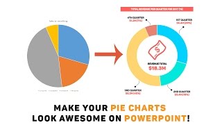
Make a 3D Pie Chart That Actually Looks Good on PowerPoint

MORE TUTORIALS? CLICK HERE: https://goo.gl/TBZibY
So far, Slide Cow has done two videos pertaining to charts. We have one to show you how to make an effective bar chart, and another to make an awesome looking pie chart. If you want to take it to the next level, though, you can follow this guide and make an eyepopping 3D Pie Chart that actually looks good on PowerPoint.
I know that the majority of 3D effects on PowerPoint look cheesey. The truth is, if we overuse (or incorrectly use) 3D designs we make a PowerPoint slide look cluttered, busy, and really difficult to interpret. In contrast, if we use them effectively, like I show you how in this video, then we can transform information into something meaningful, and of course, memorable.
Before watching the video, just please keep in mind three key messages:
1. This PowerPoint tutorial is a little tedious. Therefore, I highly recommend you follow what I do stepbystep in order to get a feel for it first. After that, you can experiment however you’d like
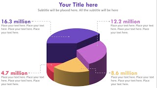
2. If you have more than six data components, categories, or ‘slices of the pie’, then do not attempt this technique as it would be difficult to get results that look good. Stick to six or less. In the video above, I have four.
3. Be sure your data is complete and final before making this PowerPoint slide, as it is difficult to make amendments to it once it is complete.
In this video, you will:
Learn how to transform a boring 2D Pie Chart into a 3D Pie Chart that actually looks good on PowerPoint.
How to use the 3D Bevel Technique Correctly on PowerPoint.
How to take advantage of Microsoft Drawing Objects on Powerpoint.
How to use effective colors, font(s), and white space on the PowerPoint slide.


![How to Make a Circular Bar Chart in PowerPoint [PPT Tricks!]](https://i.ytimg.com/vi/RtYn1jrtYH8/mqdefault.jpg)