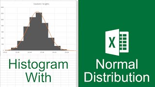
Make an interactive distribution curve (bell curve) in Excel - Easy Trick 💡
Excel Bell curves or frequency distribution curves are handy for analysing and understanding distribution of your data. Recently, someone asked me to make a bellcurve to visualize salary distribution of staff. While you can use formulas or complex techniques to make these, I used a simple trick to make the bell curve and add interactive effect to it. Needless to say, my clients were impressed.
Let me show the method in this video and take it to next level.
Time stamps for the video:
====================
0:00 The bell curve problem
0:36 Making the bell curve with Excel
3:27 Adding department as slicer
3:54 Fixing the axis issues
4:48 Taking the bell curve to next level (splitting it by gender)
5:42 Closing remarks
Example file:
==========
https://chandoo.org/wp/wpcontent/upl...
Checkout my online course on Advanced Excel & Data analysis
===================================================
https://chandoo.org/wp/excelschoolp...
#Excel #BellCurve


![What is Bell Curve? [Explained]](https://i.ytimg.com/vi/YMW3K6AQW9A/mqdefault.jpg)


