Making a Choropleth Map from FEMA Disaster Declaration GIS shapefile Data with ArcGIS Pro

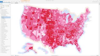
In this video, I take GIS Data from FEMA's GIS Data feed, https://gis.fema.gov/DataFeeds.html then unzip it and add it to an ArcGIS Pro project. From there I make a choropleth map, changing the symbology to graduated color based on the attribute table field Total Decelerations. With this, I notice that the data shows a pattern and that Natural Disasters and not random, so what is driving them? To verify the pattern is not random I run a Moran's I Spatial Autocorrelation tool that leads to a result that there is a clustering of the dataset. Finally, I create a map layout to show this choropleth map, making three map frames, one for the 48 states, the next for Alaska, and the last for Hawaii. Then it is to share the data, I go ahead and export a PDF that is ready to share via email or via a web browser. I did not spend much time making a pretty map. I did add a legend and title, but I think you can do better. Send me your maps in the comments below. Happy Mapping, and keep digital exploring the world!