Get real, active and permanent YouTube subscribers

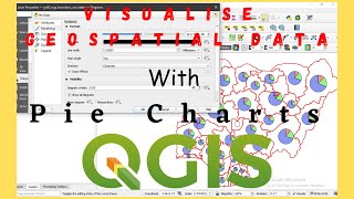
Match Layer Legend Colours with DataPlotly Pie Chart Legend in QGIS

Since the newest version (3.7) of the DataPlotly plugin it is possible to match the layer legend colours with that of the legend of a histogram or pie chart. Thanks to Matteo Ghetta and Jürnjakob Dugge for this new feature!
This video shows how to match the legend of a land cover map with that of a pie chart showing the percentage of land cover in a subcatchment.
This video is part of IHE Delft OpenCourseWare. For more free GIS materials check http://www.gisopencourseware.org


Recommended