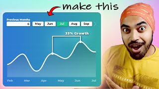
One Chart - Two Insights! Power BI Line Chart Trick with Error Bars

Welcome to ExcelFort! In this video, I'll show you how to elevate your data visualization game using Power BI with "One Chart Two Insights!" technique, you'll learn how to create a powerful Power BI Line Chart that displays both actual and budget data comparison using ErrorBars, all in one dynamic view.
Key Takeaways:
✅ Master Power BI Line Charts for advanced data representation.
✅ Gain insights into budget comparison with a single, impactful chart.
✅ Unlock the potential of ErrorBars for visualizing data variances.
✅ Enhance your data storytelling and reporting skills.
Subscribe to this channel: https://www.youtube.com/c/excelfort?s...
⏲ Video Timestamps
00:00 Introduction
00:39 Power BI basic Line Chart
01:20 Adding secondary axis series values
02:15 Adding ErrorBars to line chart
04:11 Define Min and Max range of YAxis and Secondary axis dynamically using DAX measures
05:08 Apply formatting to line chart and ErrorBars
08:32 Ending
LET'S CONNECT!
✔ / exce. .
✔ Mobile No: 00966509791858
#powerbi #powerquery #msexcel #excelfort #powerbidesktop #powerbitraining #DAX