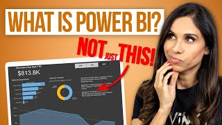
Part-1 📊 Learn how to HIGHLIGHT events on Power BI chart TIMELINE

This video shows how you can highlight or show any timebound events on a chart timeline using DAX and conditional formatting in Power BI. In addition, in this example, we will analyze and visualize how events like COVIDlockdown, promotions, campaigns etc., impact sales performance. Once you learn these techniques , you can apply them on any similar scenarios.
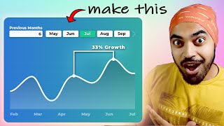
This is the part one of the twopart video series. In the second video, we will learn how to create a dynamic moving average, also called the rolling average and an informative tooltip with KPI to further enhance the value of this Power BI report.
⭕ You can find the part two video here: • Part2 How to HIGHLIGHT events, MOV...
⏲ Video Timestamps
00:00 Intro
00:26 Looking at the data model and the initial report.
02:10 Building the 1st Measure to highlight events on the chart.
05:30 Apply Conditional formatting highlight events on the chart,
06:36 Build the 2nd measure to calculate the overall average daily sales,
08:31 Build the 3rd measure to calculate the event average daily sales,
12:33 Build the 4th measure to calculate the % change of the above two measures,
15:50 Closing
⏬ You may download the completed Part1 PBIX file here:
https://excelfort.com/part1%f0%9f%9...
For Instructorled virtual training programs, visit:
https://excelfort.com/training/ or [email protected]
LET'S CONNECT!
/ excelfort
/ excelfort
/ fowmy
#excelfort


![AI Tools and Visuals in Power BI [Full Course]](https://i.ytimg.com/vi/t0uYjYic2pQ/mqdefault.jpg)