Power BI: Manage and Monitor Projects in Power BI Using Dashboards and Gantt Charts

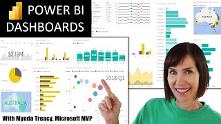
The video is a tutorial on how to manage and monitor projects in Power BI, a data visualization and business intelligence tool. The instructor explains that they will create a Gantt chart to monitor the progress of various projects and their tasks, and a dashboard to monitor the progress and status of tasks by projects, team leaders, and group heads.
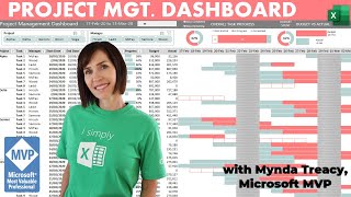
The instructor uses sample data for the project management dashboard, which has columns for task ID, parent task ID, project ID, team head, start date, end date, progress, and status. The instructor guides the viewer through the steps of importing the data into Power BI and creating the dashboard.
The instructor starts by adding a title to the dashboard and then adds a pie chart to display progress by project. The project field is added to the legend area, and the progress field is added to the values area, and changed from sum to average. The instructor notes that the progress values may not be correctly displayed on the pie chart, and shows how to change the format of the progress column to percentage in the data view to fix this issue.
Next, the instructor adds a column chart to display tasks by status. The status field is added to the X axis, and the task field is added to the Y axis as count.
Then, the instructor adds a bar chart to display progress by team leader. The progress field is added to the X axis as average, and the team leader field is added to the Y axis from the teams table. However, the instructor notes that the information is not correctly presented because the teams table and data table do not have an active relationship defined. The instructor shows how to create a relationship between the number field in the teams table and the assigned to field in the data table to fix this issue.
The instructor then adds a column chart to analyze progress by group heads. The progress field is added to the Y axis as average, and the group head field from the teams table is added to the X axis.
Finally, the instructor adds a pie chart to display progress by team leaders. The progress field is added to the values area as average, and the team leader field from the teams table is added to the legend area.
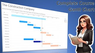
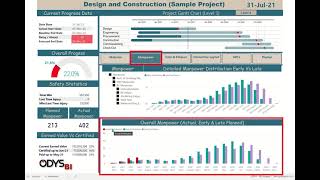
After completing the dashboard, the instructor renames the first page to "Dashboard" and creates a new page for the Gantt chart. The instructor explains that a custom visual is needed to create a Gantt chart, and shows how to import and add it to the dashboard. The instructor then adds the task, parent, start date, end date, and progress fields to the Gantt chart and adjusts the settings to make it more compact and visually appealing.
The instructor notes that the vertical line in the Gantt chart represents the current date and explains how the chart can be used to track project progress and deadlines.
The video concludes with the instructor thanking the viewer for watching and inviting them to like and subscribe for more tutorials and updates.
https://virtualschool.org/tutorial?v...
Source Data: https://docs.google.com/spreadsheets/...
#projectmanagement #PowerBI #dashboard #GanttChart #teamleaders #progressmonitoring #datavisualization #taskmanagement #dataanalysis #datamanagement #productivity #workflowmanagement #projectplanning #businesstools #workmanagement #datainsights #workplanning #projecttracking #businessintelligence