Progress Circle Chart with Conditional Formatting - Part 2 of 2

Sign up for our Excel webinar, times added weekly: https://www.excelcampus.com/blueprint...
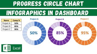
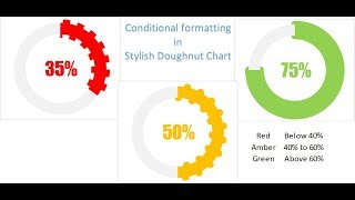
The progress circle (doughnut) chart displays the percentage of completion on a single metric. In this second video in the series, we learn how to apply conditional formatting to the chart so the progress bar color changes as the percentage of completion value changes.
DOWNLOAD the file: https://www.excelcampus.com/charts/pr...
This will make the chart stand out even more on our dashboards. The reader will be able to quickly see the level of progress and determine if the metric needs attention based on the color of the bar.
The conditional formatting is created using a few IF statement formulas in the source data range for the chart. The IF formulas create the different progress levels. When the actual progress level is within the level range, the cell displays a value and its bar is displayed in the doughnut chart. We use 3 levels in this example, but you can add as many progress levels as you'd like.
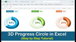
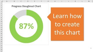
In part 1 of the series, we learned how to create the basic Progress Doughnut Chart. Both of these solutions just require 1 Excel doughnut chart and a few formulas. They are pretty easy to set up and implement in your reports and dashboards.
Watch Part 1 • Progress Circle Chart in Excel Part...
Article on the IF Function in Excel: https://www.excelcampus.com/functions...
FREE video series on Pivot Table & Dashboards: • Introduction to Pivot Tables, Charts,...


![Doughnut Chart for Excel Dashboards: Simple and Easy way! [Excel Free Template]](https://i.ytimg.com/vi/PcnLu4yzH_Q/mqdefault.jpg)


![How to Instantly Improve Your Excel Charts [Watch This!]](https://i.ytimg.com/vi/TqBYfMxVTc4/mqdefault.jpg)