R Project - how to create bar chart (ggplot2) from spreadsheet-includes data pivot u0026 remove a column

In an R script upload a spreadsheet, manipulate the data by removing column/variable, change variable name, and pivot columns, and then producing a bar chart.
Timings:
00:00 Introduction
00:40 Set up R script and load data
02:10 Remove a column/variable from the database
03:20 Change column/variable header name
04:35 Set order of category (change from default alphabetical)
07:20 Pivot using pivot_longer (tidyr package)
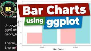
10:10 Set up bar chart (ggplot2 package)
13:00 Add labels to bar chart
15:10 Themes (theme()) changes to bar chart
19:00 Change colour of bars/columns.
The video mentioned at 3.10 relating to altering the number of observations/variables (rows/columns) can be found at • In R dataframe how to alter the num...
There is a lot more alterations which can be done to the bar chart using ggplot2. A reference which you may find helpful https://ggplot2.tidyverse.org/referen.... This also explains why geom_col is used in this video, rather than geom_bar ie it is because want height of bars to represent the values in the data.
The excel spreadsheet used in this project can be found at https://dataforknowledge.co.uk/rproj...
Note: 3rd party data was used in this project therefore I take no responsibility for the quality or accuracy of the data. The data can be found at https://www.gov.scot/publications/tea...
#rprogramming #barchart #ggplot2 #rproject #data #ggplot2barchart