A little secret to rock your YouTube subscribers

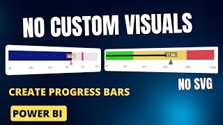
Simple Gauge Chart Alternatives in Power BI

The Gauge Chart is not everyone's "goto" visual in Power BI. But what if you want to show some kind of scoring value? What can we use?
Here, I show some simple alternatives using vertical and horizontal stacked bar charts, reference lines and a few little tricks to give a nice clean finish.
Subscribe for more Power BI advanced tips and tricks.
SOCIAL MEDIA
LinkedIn: / gerardduggan15420a55
Twitter: @DGAnalysis
BLOGS & WRITING
Medium: / duggangerard
DGAnalysis: https://dganalysis.com/
Maven Showcase: https://mavenanalytics.io/profile/Ger...


Recommended