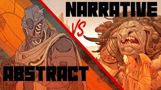
Struggling To Pick Colors? Learn This!

Check out my Free Illustration Mini Workshop where I share my journey from Amateur to Pro: https://www.thedrawingcodex.com/illus...
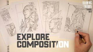
You will get some simple advice on how to get more detail and polish in your work. How to think about composition. And my thoughts on how to prepare for professional work.
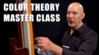
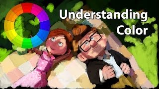
Let's talk about how to actually apply color theory... through thinking about color proportion.
Below is an Automagically generated summary to help understand the video and aid search optimisation:
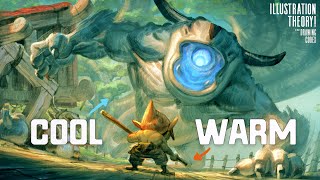
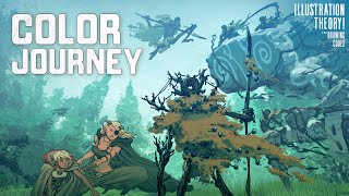
Color distribution within your artwork is fundamental to creating a captivating visual narrative. The challenge lies in determining not just which colors to use, but also how much of each color should be present to achieve a harmonious balance. This isn't about striking a 5050 balance; artistic composition often demands a more nuanced approach.
Understanding color proportion is crucial for developing visual hierarchy, ensuring viewers perceive your artwork in a desired sequence. By visualizing color proportions through a pyramidlike structure, you can more effectively plan and adjust your images, ensuring each layer supports the next in guiding the viewer's eye.
In this discussion, I delve into the concept of balancing intense colors with neutral tones to create a dynamic composition. This method is particularly useful when dealing with complex scenes, whether in illustrations, comics, or even cinematic visuals. Through practical examples and a straightforward breakdown, I aim to demystify the process, making it accessible and applicable to your own creative projects.
Remember, the majority of an image often comprises subdued, neutral tones, which set the stage for vibrant accents to stand out. This strategic use of color contrast is what draws the viewer's attention to focal points, enhancing the overall impact of the composition. By understanding and manipulating these principles, you can elevate your artistry and engage your audience more effectively.
00:00 Intro
03:01 Welcome
03:44 Rules Are Rules?
06:18 Color Proportion Basics
23:09 Balance & Proprtion In Composition
26:31 How To Apply This...Two Strategies
31:09 Adjusting Color Proportion On The Fly
33:44 Balancing Visual Hierachy and Your 123 Read
38:47 How Mystical Is Balance Really?
Happy Drawing!
Tim Mcburnie
Learn Drawing and Illustration from me: www.thedrawingcodex.com
Portfolio: www.timmcburnie.com
www.artstation.com/timmcburnie
www.instagram.com/timmcburnie
twitter.com/timmcburnie