
The new responsive: Web design in a component-driven world | Session

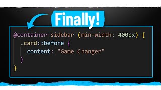
The web community is entering into a new era of responsive design and shifting our perspectives on what it means. With user preference queries, container queries, and other formfactor queries on the horizon, we'll soon have the tools to create responsive designs far beyond what querying the global viewport allows. This Session highlights what it means to be responsive to the user, container, and formfactor, along with how to implement some of these new axes of responsive design.
Speaker: Una Kravets
Watch more:
Web at Google I/O 2021 Playlist → https://goo.gle/io21ChromeDevs
All Google I/O 2021 Technical Sessions → https://goo.gle/io21technicalsessions
All Google I/O 2021 Sessions → https://goo.gle/io21allsessions
Subscribe to Google Chrome Developers → https://goo.gle/ChromeDevs
#GoogleIO #Web #Design
product: Chrome General; event: Google I/O 2021; fullname: Una Kravets; re_ty: Premiere; ;


