The Simple Color Schemes Pro Artists Use: (Try Them)

Check out my Free Line and Color Quick Start Guide: https://www.thedrawingcodex.com/quick... You will learn how to develop a simple reliable process in photoshop. You also get all the brushes and PSDs that I use in the guide (the same ones I use for most of my illustrations).
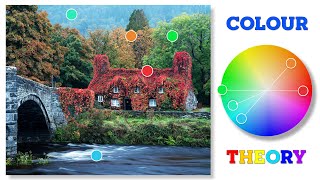
Let's study some different art books to learn about how artists use simple color plans! This will give you some solid examples of the color theory underlying great images.
Here is an Automagically generated summary to help with search optimisation:
Simplicity often reigns supreme. This video explores how artists create vibrant, compelling works with straightforward color schemes, examining art to uncover the power of simplicity in color application.
LIST OF BOOKS AND ARTISTS MENTIONED, ALONG WITH KEY TAKEAWAYS:
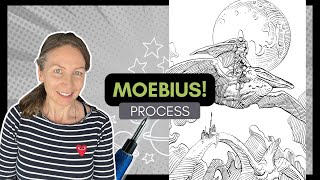
1 JEAN GIRAUD (MOEBIUS): Takeaway: Moebius's work demonstrates the power of simple color schemes grounded in complementary and monochromatic choices, proving that even psychedelic and vibrant illustrations can be rooted in basic color theory.
2 HAYAO MIYAZAKI'S PORCO ROSSO: Takeaway: The red plane against the blue sea and sky in "Porco Rosso" showcases a striking primary color scheme, emphasizing how bold contrasts and minimalistic color choices can create memorable visuals.
3 KAZUYO OGA (STUDIO GHIBLI BACKGROUNDS): Takeaway: Ghibli’s use of harmonious, analogous color schemes, particularly in their depiction of natural environments, illustrates how a limited palette can evoke a strong sense of place and mood.
4 FRANK FRAZETTA: Takeaway: Frazetta’s artwork, often featuring monochromatic scenes with a pop of color, highlights the effectiveness of using a restrained palette to draw attention and add vibrancy to specific elements.
5 TIM MCBURNIE'S OWN WORK: Takeaway: McBurnie’s approach to setting his comic in a forest environment with a consistent green and blue palette, accented by characters with contrasting colors, exemplifies the efficiency and visual appeal of sticking to a simple, cohesive color scheme throughout a project.
Happy Drawing!
Tim Mcburnie
Learn Drawing and Illustration from me: www.thedrawingcodex.com
Portfolio: www.timmcburnie.com
www.artstation.com/timmcburnie
www.instagram.com/timmcburnie
twitter.com/timmcburnie