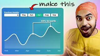
Trend Visualization in Power BI

In this video I go over all the steps to create an arrow chart in Power BI without having to rely on any custom visual.
Enjoy this video and subscribe to always stay updated on my favorite Power BI tricks :)
Download file here https://datatraining.io/powerbihowto
TRAININGS
Power BI Design 4 Weeks Transformation Program https://my.datatraining.io/pages/powe...
Power BI Essentials https://datatraining.io/powerbilearni...
Business User Training https://datatraining.io/powerbibusin...
For Custom Trainings and Consulting email directly [email protected]
⏱ TIMESTAMPS ⏱
00:00 Intro
00:45 Creating the starting points for the arrows
02:48 Conditional formatting work around
04:59 Adding the arrows up and down
07:51 Adding labels to show change or current period value
10:26 Adding labels to show % change
13:16 Repositioning the % labels in the middle
18:08: Adjusting the sorting order
19:18 End
JOIN
Join https://bit.ly/4b453bi
Subscribe https://bit.ly/31MnQGO
Insta / howtopowerbi
LinkedIn / basdohmen
TikTok / how.to.power.bi
X / howtopowerbi
fb / howtopowerbi
Threads https://www.threads.net/@howtopowerbi
Newsletter https://datatraining.io/newsletter
CHECK THIS OUT!
My gear https://amzn.to/47F21Yc
Power BI books MUST READ! https://amzn.to/3tUfFcj
General books I recommend https://amzn.to/48YNo33
Music for my videos https://www.epidemicsound.com/referra...
For growing on YouTube: https://www.tubebuddy.com/bas
Stuff I use daily https://amzn.to/3HqfMQ2
* Above are affiliate links, which means at no additional cost to you, if you make a purchase using these links we will receive a small commission. It supports us and helps us to continue making more How to Power BI videos!
Thanks for being a part of this channel and all your support!
#HowToPowerBI #PowerBI #DataTraining
#powerbidesktop #powerbitraining #powerbideveloper #DAX