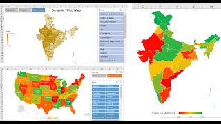
Use 3D Maps in Excel - Create Beautiful Map Charts

In this video, we look at how to use the 3D Map charts in Excel to create beautiful geographic insights.
These charts are only available in Excel 2013 known as Power Maps and Excel 2016 as 3D Maps.
3D maps allow us to create insights into our data that we cannot do with regular charts. To be able to map data geographically and see patterns.
These charts provide plenty of functionality to navigate, zoom, adjust charts types, formatting and much more. You can then export your visual as a video or an image.
Find more great free tutorials at;
http://www.computergaga.com
** Online Excel Courses **
The Ultimate Excel Course – Learn Everything ► https://bit.ly/UltimateExcel
Excel VBA for Beginners ► http://bit.ly/2JvnnRv
Advanced Excel Tricks ► https://bit.ly/3CGCm3M
Excel Formulas Made Easy ► http://bit.ly/2t3netw
Creating Sports League Tables and Tournaments in Excel ► http://bit.ly/2viGg3J
Connect with us!
LinkedIn ► / 18737946
Instagram ► / computergaga1
Twitter ► / computergaga1


![HandsOn Power BI Tutorial Beginner to Pro [Full Course] ⚡](https://i.ytimg.com/vi/77jIzgvCIYY/mqdefault.jpg)