Using Design Techniques for Clear and Appealing Data Visualization

Let's look at how we can implement design concepts and techniques to maximize the impact of our dashboards and reports. We don't want our visualizations to be ugly, but we also want them to clearly convey the data story. We can achieve this balance using some of the same practices graphic designers utilize.
⏯RELATED VIDEOS⏯
Telling Data Stories: • Telling Data Stories, how to impact d...
The Art of Visualizing Data: • The Art of Visualizing Data, Examples...
Data Podcast ►► https://open.spotify.com/show/4PWmW2g...
Website ►► https://www.nullqueries.com/
Data courses (Not Produced by nullQueries)
Azure Data Engineering: https://click.linksynergy.com/deeplin...
DE Essentials, hands on: https://click.linksynergy.com/deeplin...
VIDEO GEAR
Programming Mouse: https://amzn.to/3zEom7f
Lighting: https://amzn.to/3o8tXAM
RGB light: https://amzn.to/3o8AQBS
USB Microphone: https://amzn.to/3m3hjAt
Mixer: https://amzn.to/2ZyqMIk
XLR Microphone: https://amzn.to/3AHPZ0L
VIDEO SOFTWARE
music/stock: https://1.envato.market/rnX70y
For business inquiries please contact [email protected]
Some of the links in this description are affiliate links and support the channel. Thanks for the support!
00:00 Intro
00:31 Balance
01:02 Whitespace
01:20 Patterns
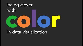
01:59 Color
02:30 Text
03:04 Picking a Visual