Visualize Temporal Data in ArcGIS Pro

To see the stepbystep tutorial, visit http://ow.ly/Ma2O50FTtnu
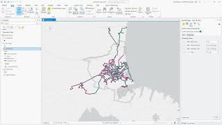
ArcGIS Pro provides several options for visualizing temporal data. In this tutorial, you'll create a line chart and dynamic map, visualizing Chinese tourism in New Zealand. You’ll add an Excel worksheet to the project, transpose table fields, and join two layers. You’ll also learn how to modify line charts in ArcGIS Pro, along with using the time slider.
This video was created with ArcGIS Pro 2.8.
00:00 Introduction
00:43 Open the project
01:17 Add an Excel worksheet to the project
01:45 Transpose table fields
03:25 Add a field and calculate its values
04:00 Convert time values to date format
04:21 Join the table to the layer
05:30 Visualize trends with a line chart
06:25 Modify chart properties
07:09 Symbolize the territorial authorities
07:54 Enable time and visualize the data
Follow us on Social Media!
Twitter: / esri
Facebook: / esrigis
LinkedIn: / esri
Instagram: / esrigram
The Science of Where: http://www.esri.com