Warm Vs Cool Rules: Do Great Artists Actually Follow Them?

Check out my Free Illustration Mini Workshop where I share my journey from Amateur to Pro: https://www.thedrawingcodex.com/illus...
You will get some simple advice on how to get more detail and polish in your work. How to think about composition. And my thoughts on how to prepare for professional work.
Let's look at how successful artists use Warm and Cool color theory to help make great images!
Below is an Automagically generated summary to help understand the video and aid search optimisation: (I think it does a pretty good job of summing things up, despite sounding a bit generic)
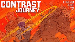
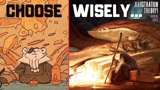
Exploring the concept of warm versus cool colors in art is essential for enhancing the contrast and depth in your images. In this study session, we'll dive into how professional artists utilize these concepts across various styles, from cartoonish to tonalist art, demonstrating the versatility and impact of color temperature in visual storytelling.
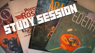
Let’s analyze art books featuring works that effectively use warm and cool colors to heighten the sense of contrast. This isn't just about theory; it's about seeing these principles in action, which can sometimes contradict traditional rules, providing a richer understanding of artistic expression.
During our session, we'll examine the subtleties of how colors interact within an artwork—how a warmer red can significantly alter the mood against a cooler blue background, or how light and shadow play across forms to bring life to the figures depicted. This approach isn't limited to any single genre but spans from vibrant comic book art to the nuanced shades of tonalist paintings.
Understanding how to manipulate the temperature of colors to control visual focus is crucial. Whether it’s the dramatic use of cool shadows in a tonalist landscape or the bold contrasts in a comic panel, each method provides unique results that can enhance the narrative and visual impact of your work.
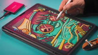
This video is designed as an interactive lesson, not just a presentation. It's about engaging with the material, questioning the "rules" of art, and applying these insights to your own style. Whether you're adapting these techniques to digital art or traditional media, the goal is to enrich your artistic toolbox with a deeper comprehension of how warm and cool contrasts can define and refine your artistic vision.
Artists Mentioned:
Mobius (Jean Giraud)
Frank Frazetta
John Singer Sargent
Artists from Capcom Design Works (Not named individually)
Kerascoët and Hubert (as a collaborative pair)
00:00 Intro
01:45 Welcome
02:37 Study Session!
03:20 Frazetta
10:36 Moebius
15:38 Capcom Design Works
21:09 Sargent
25:56 Kerascoet & Hubert
29:31 Out!
Happy Drawing!
Tim Mcburnie
Learn Drawing and Illustration from me: www.thedrawingcodex.com
Portfolio: www.timmcburnie.com
www.artstation.com/timmcburnie
www.instagram.com/timmcburnie
twitter.com/timmcburnie