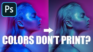
Why do bright colours look dull in prints? Printing bright colour art/text on cards and products.

Colours that look great on screen can look weak and lack contrast/brightness when printed, especially on cards and other non photo media. Use this printer test image, to test what colours your printer can manage and pick your colours from the print, not what they look like on screen.
This particular test image should be printed _exactly as you would print normally_. It is just a file with strong colours in it. This one is not meant as a general test of print quality.
So if you print your images from a phone do just that
If you print images from Photoshop with profiles do that
If you print from some design software with no special colour settings do that
It is a test image to show the range of colours your printer can manage at your normal print settings, so you can compare the print to what is on the screen. It needs no extra or special colour management or profiles. Even phones and tablets should work with it
If you want test images to check more general print quality, use one of the ones from the test images page below.
All my test images [including this one] are at
https://www.northlightimages.co.uk/p...
For a full categorised index of all my videos, see:
https://www.northlightimages.co.uk/k...
If you'd like to make a small donation, I have a Kofi page:
"Buy me a coffee" https://kofi.com/keithcooper
My articles and videos are always free to access.
Any help with running this channel is gratefully received.
I also have some affiliate links which earn me a commission if used.
US Amazon photo/print gear: https://amzn.to/3l9vJC6
B&H Photo: https://www.bhphotovideo.com/?BI=2008...
Adorama: https://www.adorama.com/?utm_source=r...